


Back in the end of February we took a look at long term charts for five different currency pairs to see what swing trading indicators opportunities we could find. It’s now eight months later so let’s see if any of these opportunities panned out. All of the charts that follow will have a vertical line on the end of February so that we can clearly see what has happened since then.
EURUSD with Swing Trading Indicators
The monthly chart showed us a tight consolidation range that went back to January, 2015. This consolidation has continued and we only saw a single break of the upper channel but that immediately reversed and never closed above it. However there was another opportunity, as we pointed out at the time:
We have an additional opportunity at the current price level. We are entering a smaller consolidation area that goes back about six weeks. A break or bounce out of this could yield a push to the upper or lower support/resistance zone. This would obviously be a smaller and shorter swing trade.
We did get a bounce off this trend line support and saw price head all the way to the upper resistance zone, giving us a nice 500 pip trade. You can see this in Figure 1 below. You can see that the bounce happened just a couple of days after our February post.
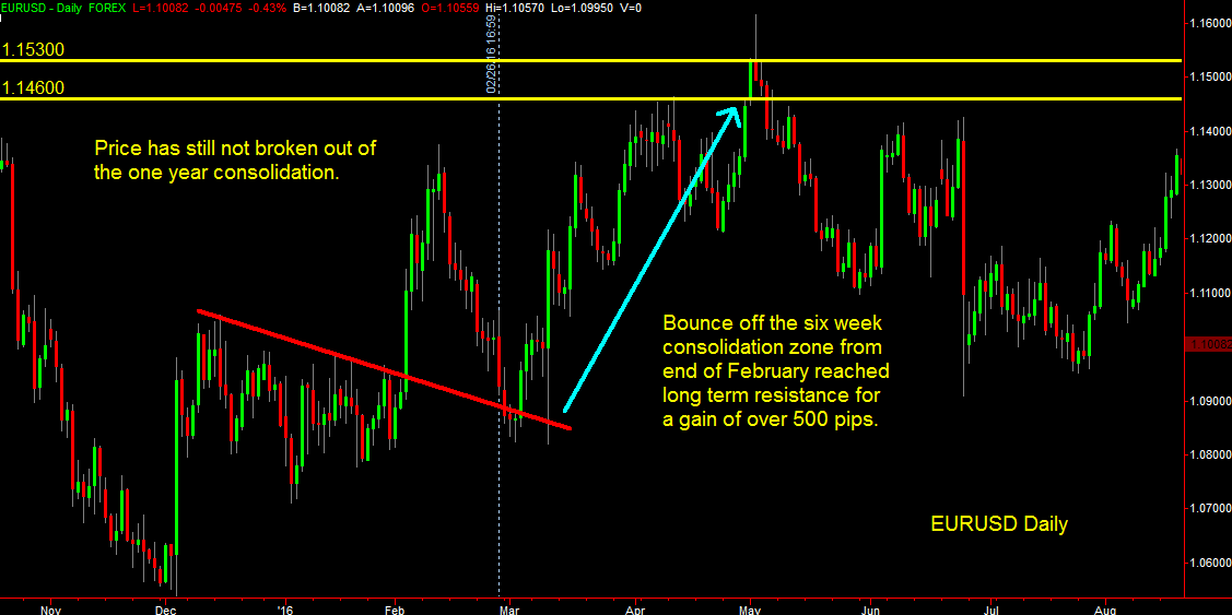
Figure 1
EURJPY
The monthly chart showed us two strong support/resistance zones with swing trading indicators and at the time we said:
Price has already penetrated the upper zone and when you switch to a daily chart you’ll notice we have a good entry opportunity here. We have a risk of roughly 180 pips but the target of this trade is the lower support zone for a possible reward of more than 400 pips.
A better opportunity presents itself on a break of the lower support zone. The next support level is at 111.50 so that break would yield a reward of 700 pips.
We did go short at the time but unfortunately price pulled back farther than anticipated and we stopped out with a 180 pip loss. The pullback however was very orderly and we were able to reenter the short on a break of the pullback. This trade worked out extremely well and you can see from Figure 2 that we had a very strong move to the lower support zone for a total gain of 1100 pips.
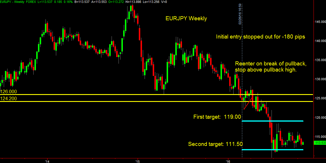
Figure 2
GBPUSD
When we looked at the monthly chart and our swing trading indicators back in February we said:
… we see that we are approaching a support zone that was established seven years ago… Bounce or break should be good for a couple of thousand pips if you have the patience to hold on.
As you can see from Figure 3 we did indeed break the seven year support level and were rewarded with a very nice short trade that moved 1700 pips in our favor. We think we have some more potential on this trade and are currently sitting on 1400 pip profit and holding as we anticipate a continuation of this move down to the 1.1300 – 1.1500 area.
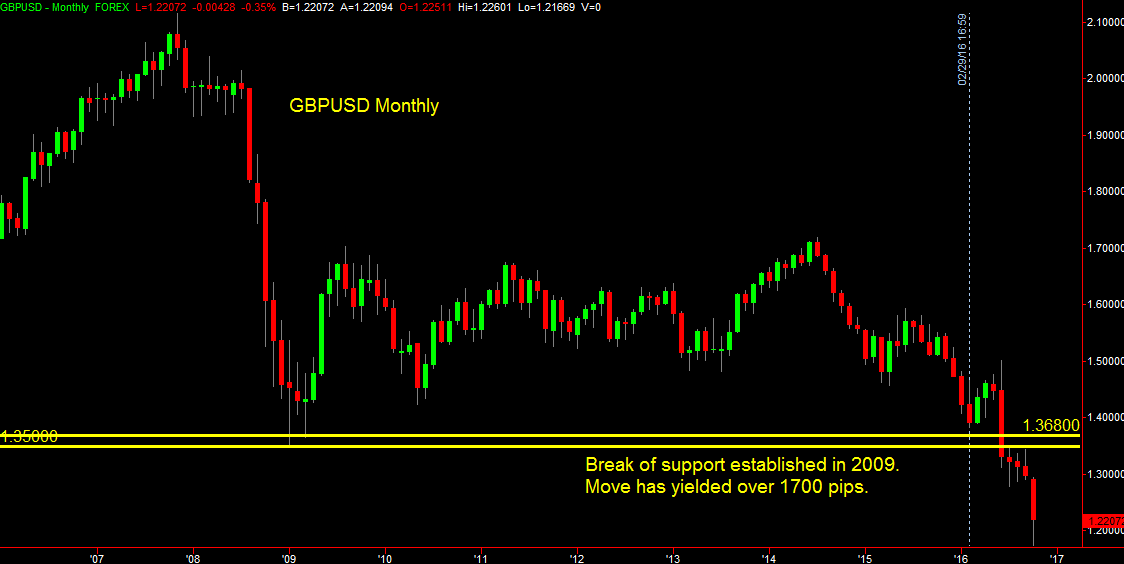
Figure 3
AUDUSD
In the February post we said:
The AUDUSD has a promising formation. You’ll see from the monthly chart that we just broke a long term trend line and are now consolidating right below it… The big picture play here is to trade a break of the consolidation zone.
We also saw a shorter term opportunity with a break of a short term trend line on the daily chart. As you can see from Figure 4 neither of these opportunities was realized and instead price moved back above the consolidation zone. No trade was taken because of this. We now have another opportunity to go short on a break of the trend line on the monthly chart. This break should result in a move down to 0.6500 at a minimum.
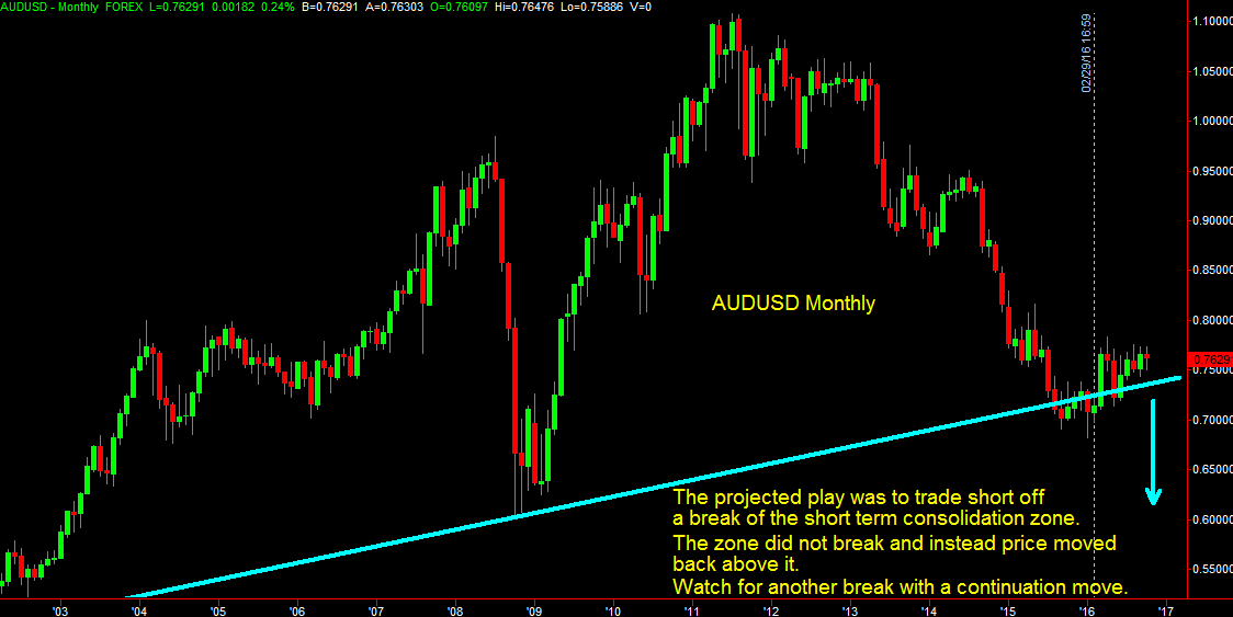
Figure 4
USDCAD
We saw a big opportunity in this pair when we looked at the monthly chart:
We have a big opportunity on a break of 1.4300. We recently had a failed attempt at this but we look poised for a second attempt if we manage to bounce off the support zone around 1.3200.
We’re still waiting for this bounce to play out. Price has essentially been consolidating at the support/resistance zone since early March. The bounce hasn’t come but when it does we still look for a break of the 1.4300 level as you can see in Figure 5. We now also see what could be the beginning of a head and shoulder formation. We have the left shoulder and the head, and a move down in price would give us the right shoulder for a new short trade opportunity. We’ll have to wait to see if either the long or short opportunity pans out.
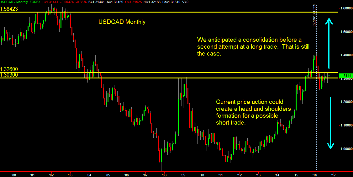
Figure 5
So there you have it. Three of the five long term charts worked out quite well with a total 3000 pips gain and a single loss of 180 pips in the EURJPY. On the AUDUSD and USDCAD we’re still waiting for the moves. Looking at these longer time frames helps us to filter out a lot of the noise that we see in the daily and four hour charts and can provide a road map for future direction. You can use these insights to your advantage even when trading on the faster time frames as they can show you how far to target your moves and where to expect support or resistance in your trades. As we said back in February:
Stepping back and taking a bird’s eye (or jetliner) view of the markets will often point out possibilities that we miss when we’re in the trenches dragging ourselves through the minefields of the five and fifteen minute charts. That does not mean that the faster time frames should be avoided. The same type of analysis can be applied to all time frames, but we recognize that the rewards, and risks, will be commensurately smaller and that the vulnerability to choppy, news driven price action will be greater.
Opportunities abound. Get in the habit of looking at the higher time frames. It will take just minutes to scan a large number of pairs but you’ll get a much clearer view than you would monitoring the minute by minute daily gyrations.
Good luck in all your trading.
 Posted in